Mastercard's Interactive Map
How location data became an immersive discovery tool that drove 55% new users into the Mastercard ecosystem.
Creative StrategyCreative DirectionUX DesignWeb DevelopmentIllustration
 Erlen Masson
Mastercard
How location data became an immersive discovery tool that drove 55% new users into the Mastercard ecosystem.

This one started before there was a client.
Freeda Media wanted to pitch Mastercard on a campaign for women's football in the UK. They brought me and my team in at the pre-sale stage, and we built the pitch strategy and the working prototype they took into the room. That pitch won them the partnership. Then we built the thing itself, Freeda and Mastercard's first ever digital experience.
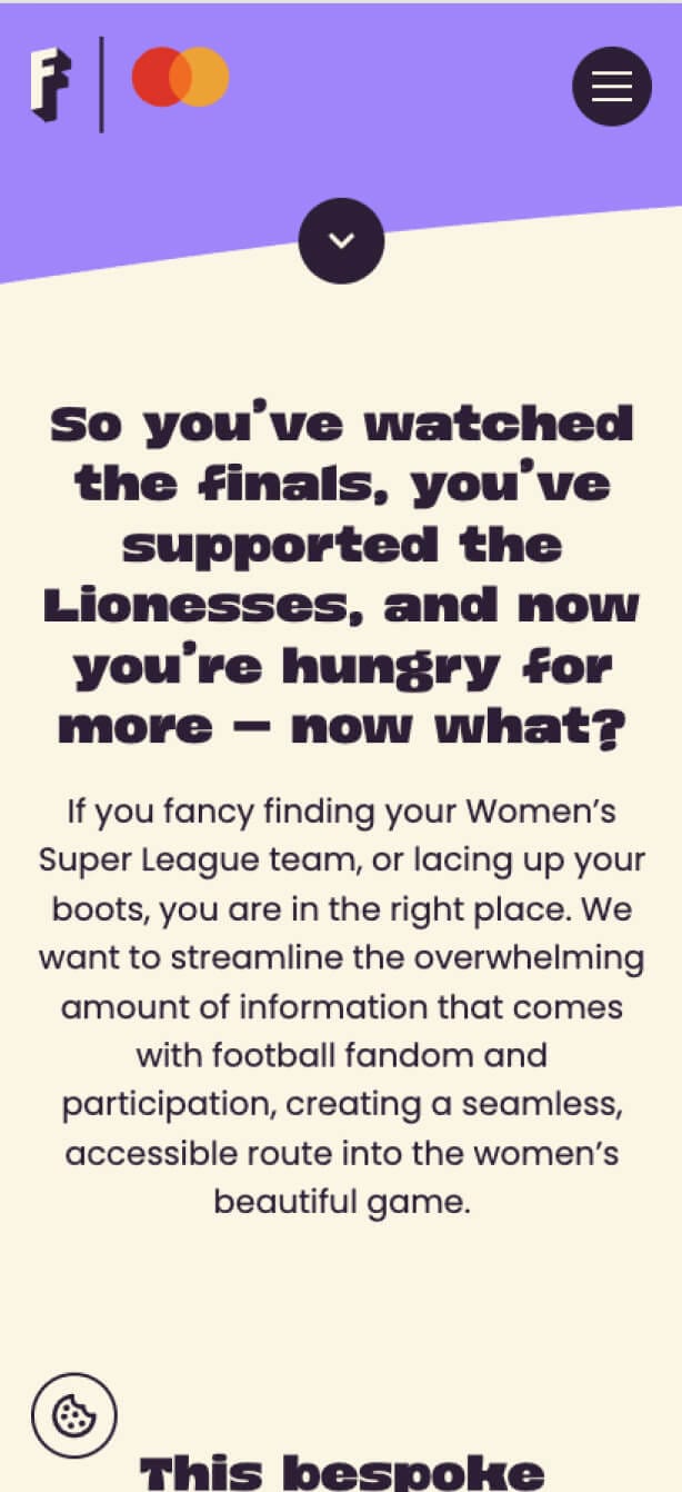
The brief underneath it was simple to say and hard to do. Get more women playing grassroots football, not just watching it. Freeda handed us a database of local clubs and Women's Super League teams, and the question was what to do with it.
Most campaigns bury location data in the backend and put a sign-up form out front. Forms are where people leave. They drop off before they've found a club worth joining, so the form is measuring friction rather than intent.
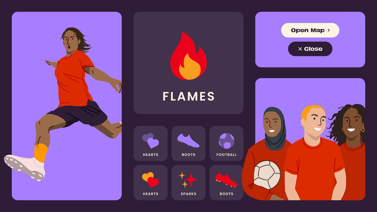
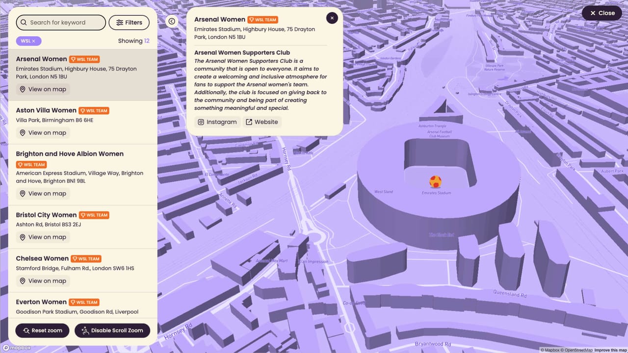
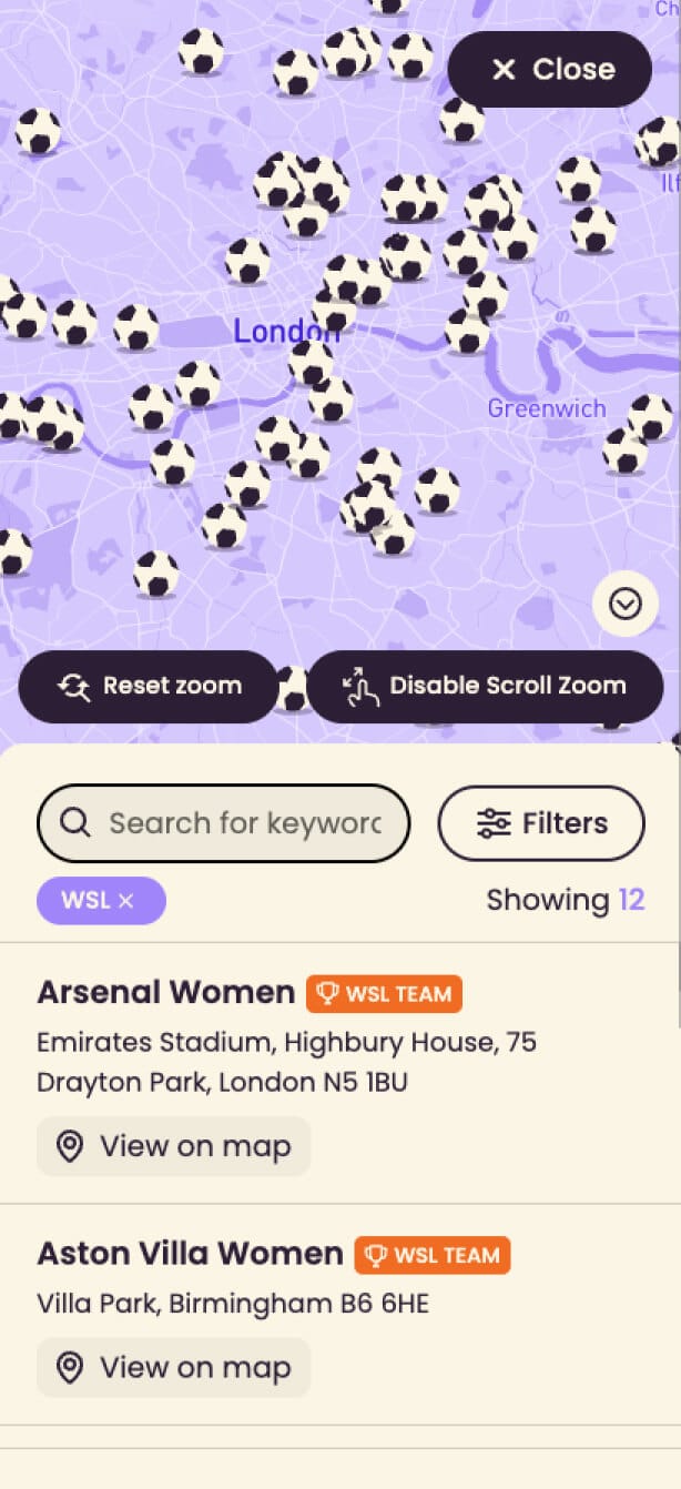
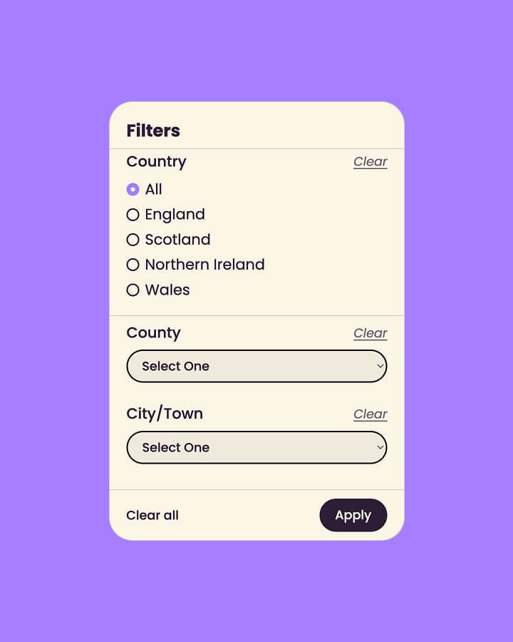
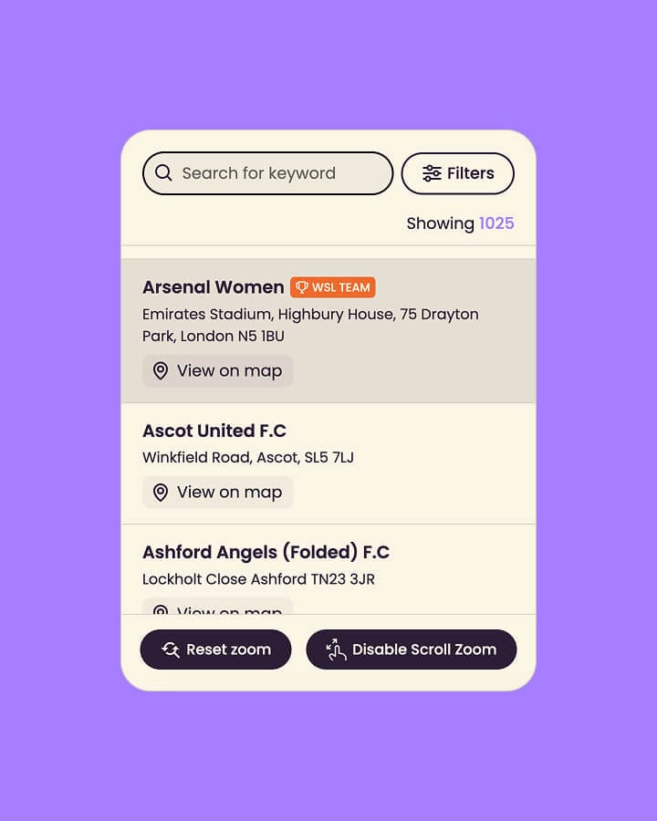
So we inverted it. The dataset became the interface, built for exploring rather than completing. We custom built the microsite in Webflow and Mapbox as an interactive map, with filters for location, inclusivity information, contact details, social links and quotes from the clubs themselves, plus a scrollable section for the WSL teams.
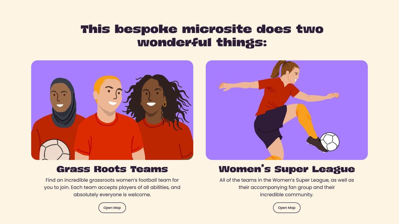
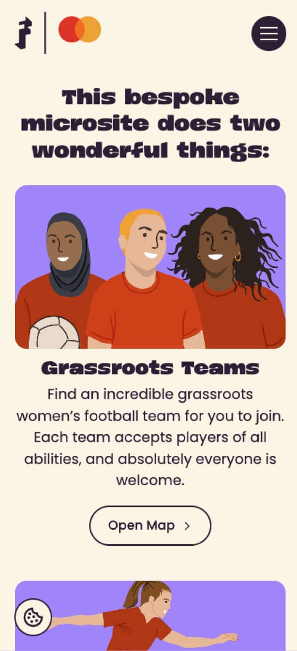
Representation was treated as infrastructure, not decoration. The illustrations included Black women, women in hijabs and women with short hair, because a player has to see herself in the thing before she'll act on it.
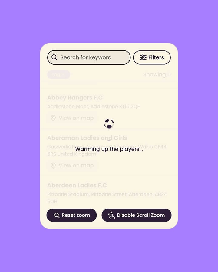
Then we made it behave like the sport rather than a directory. Football animations, player movements, and loading screens that say "warming up the players".
And because behaviour change doesn't fit inside a media window, we built it to outlast the campaign rather than switch off with the spend.
The map did the work. Nearly three quarters of everyone who landed actively used it, 1.6K interactions in a short window. Most branded content counts engagement in single digits. This got people playing.
It reached past the existing audience too. 55% of users were new, so the campaign found women Freeda hadn't been reaching.
But the result I'd point at came before any of that. The prototype won the account. Freeda trusted us to be the thing that got them into the room, and the work we made to win the pitch is the same work that shipped.
Let's talk
Every project starts with a conversation. Tell me what you're building and I'll take it from there.